Success Stories
SAFE Credit Union’s Credit YOUnion Campaign
By Donna Adinolfe
Background: SAFE Credit Union, serving the greater Sacramento, CA area, launched a new branding awareness campaign over the summer that celebrated its members and the diversity of its membership using messaging that centered on YOU. The goal of the campaign was to stand out from the competition and focus on “why” to join a credit union rather than present typical products and services messaging.
What they did: The campaign appeared in television ads, digital placements such as YouTube and Hulu, larger-than-life billboards and in local print publications. The visually bold campaign focuses on what sets the nearly 80-year-old institution apart. It also featured real Sacramentans in locations iconic to California’s Capital Region, including the Tower Bridge, Sutter’s Fort and the state Capitol.
SAFE CEO and President Dave Roughton sent emails to staff and members explaining the campaign and how it reflects the culture of SAFE. The messaging, visuals and other elements of the campaign were reflected in marketing collateral in branches and in the Folsom headquarters. Staff members were rewarded for sharing the campaign on social media. Retail staff and members took photos of themselves holding cutout YOU signs at Member Appreciation Day events, sharing on social media and with co-workers through internal communication channels. Marketing provided fun stickers riffing off the theme to distribute at events and for staff to show their SAFE pride.
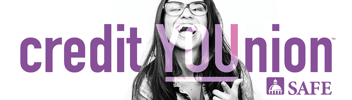
The advertising agency, un/common, created a logo for the campaign that was a 180-degree change from the credit union’s standard logo. The bold, big, sans-serif treatment combined with the lower-case treatment of “SAFE” and the use of colors beyond the official blue broke every rule the credit union had about logo treatment. Riffs on the logo incorporating different images and replacing the dome helped SAFE better connect with the community, such as replacing the dome with the mascot for the local Triple A baseball team. This logo will be used on uniforms when the SAFE Convention Center and Performing Arts Center opens in late 2020.
Results: The campaign significantly moved the needle on consumer awareness for the credit union, encouraged some people to apply for jobs at the credit union, and got the community talking. It increased consumer awareness by 35 percent in just three months. It also increased the average number of new accounts by more than 300 a month and grew new balances by $15 million year over year. The credit union launched phase 2 in 4Q, featuring images of SAFE staff.
Key lessons learned:
- Go big, go bold, go simple. The iconic imagery and YOU language launched SAFE Credit Union out of the cluttered crowd of financial institutions advertising in the Greater Sacramento area. While others advertised rates and products, SAFE celebrated members and neighbors with emotion and clarity through bold imagery, simple messaging and a compelling video that honors the humanity of those they serve.
- Inclusivity matters. The Sacramento area is one of the most diverse in the nation. Showcasing people from various backgrounds and life experiences lets members and potential members know they have a place at SAFE. They incorporated that philosophy into its second phase of the campaign featuring SAFE employees in paid social media posts. Going forward into 2020, the campaign will include more SAFE staff members and grow visually for enhancing the campaign.
- Get everyone in your credit union on board. The SAFE CU Marketing Department led a company-wide effort to incorporate the spirit of the SAFE Credit YOUnion campaign into the corporate culture from Day 1.
- Embrace breaking the rules. The YOU campaign took SAFE’s advertising and marketing into a completely different direction from where it had been for the past 5-10 years. The brand voice changed to be more direct and centered on members. The look of all marketing and advertising collateral changed overnight as the credit union moved from a more traditional art direction to one that boldly incorporated black and white imagery, close-ups of people, a new color palette and an entirely new way of promoting the credit union. The branding campaign logo further helps SAFE stand out and literally be better seen in the marketplace.